RadioACTive
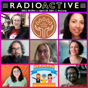
At minute 6:45, I spoke with RadioActive host Lara Jones about the Better Utah Institute Civic Engagement Toolkit and how Utahns can take steps to get civically engaged.

At minute 6:45, I spoke with RadioActive host Lara Jones about the Better Utah Institute Civic Engagement Toolkit and how Utahns can take steps to get civically engaged.
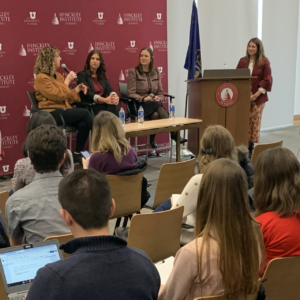
Previous Next Action Utah held many panel discussions, and I was responsible for setting up a/v equipment, filming, and livestreaming them. I used Open Broadcaster Software (OBS) to impose graphics, monitor audio levels, record live video, and stream to Facebook.
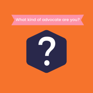
I designed this personality quiz to educate people about the various ways to get civically engaged. So often, people think you need to be an extrovert or a barnstormer to be an advocate, but advocacy can take many forms. It also serves as an intake survey to get a baseline on current knowledge and civic …

H5P is a free and open-source content collaboration framework based on JavaScript. I’ve used it to create interactive games and interfaces to support learning curriculum I have designed. I created this game as part of the Better Utah Institute Civic Engagement Toolkit. It aims to teach users that while there is an optimal path to …
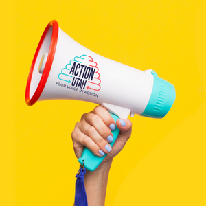
Action Utah was a nonpartisan advocacy organization working to empower Utahns from both sides of the aisle to get involved. I designed this logo to reflect that mission using a beehive symbol created by an arrow on the left in the brand’s signature turquoise color representing the political left and the right represented by the …

https://vimeo.com/manage/videos/658402994 This video is a take off on the opening credits of the Real Housewives franchise. It was created to educate Utahns about the leaders of the Legislature. I made it using Adobe Premiere, Adobe After Effects, and a cartoon rendering program called Toonly.
This project began as a weekly email series but was modified to a once-monthly bulletin. It’s intended to inspire subscribers into taking action in their communities and to subtly inform readers about what civic engagement can look like. I designed the header, draft the messaging, find the items of note, and create it in the …
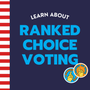
The aim of the project was to explain Ranked Choice Voting, a concept that eludes many people, in the simplest way possible. I used the visual language of a traditional school composition book and punny stickers to try to bring levity to an otherwise dry topic. I designed all of the graphics, wrote the copy, …
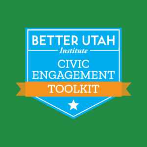
Talk about a labor of love! This project started at one organization and finished at another. I spent from June 2020 to February 2022 developing and launching this toolkit. It was genuinely a dream job. It allowed me to work toward my personal goal of inspiring and educating everyone about civic engagement. One of the …
How You Can Get Involved in Politics A lot of folks feel the urge these days to make lawmakers hear their voices. But how do regular people get involved in the political process? Melissa Nelson-Stippich, the engagement director for the Better Utah Institute, chatted with Boyd about their latest Civic Engagement Toolkit. The online …